Monroe Truck Equipment rebrands with focus on muni, commercial markets

After more than 60 years as a leader in the work truck industry and snow and ice management, Monroe Truck Equipment has rebranded the organization.
This rebrand “clarifies” Monroe Truck Equipment into three core divisions: Commercial, Municipal, and Corporate. Each division now has a dedicated team, separate websites, and expanded facilities for each division at the Monroe, Wis., headquarters, according to the company.
“We’ve reimagined how we serve our customers. Our goal is to make it easy to do business with us,” said Tom Ninneman, CEO at Monroe Truck Equipment Inc. “We still offer the same dependable, high performance truck equipment that the industry has come to rely on. Despite the different brands through our commercial work trucks, municipal truck equipment, and trailer divisions, we are still one Monroe.”
Monroe Truck Equipment is an equipment designer, manufacturer, upfitter and distributor that serves the commercial work truck industry, and also municipalities across America as a snow and ice management truck equipment manufacturer and upfitter.
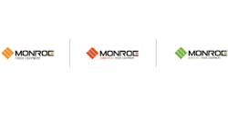
In the new branding color scheme, municipal customers will see a “visibility” green to reflect their commitment to the safety of their communities, Monroe noted. Commercial customers will experience a “strong, confident” orange. Monroe Corporate and Careers takes up a “rich, salt-of-the-earth” goldenrod.
“We’ve updated our classic look to better align with the direction we’re moving Monroe Truck Equipment: forward,” said Amanda Field, marketing team lead. “Our new logo features a strong and bold ‘MONROE’ visually carrying the impact from our old logo. The icon is a customized ‘M’ reflecting our ability to customize for our customers, and is a visual nod to our industry that is reminiscent of a tire track.”